

Who can resist a thorough round-up of packaging trends? Managing director of creative agency The Offices, Stephanie Oley, looks at how to tap into a trend without the pitfalls of falling for a fad.
A good trends piece is very satisfying, providing the ultimate checklist when reviewing your brand identity about what to add, change, or retire. It can also help you avoid decisions that go too far and risk making your brand look faddish, which dates your look and can give the impression of your business being passé.
Be guided by strategy
Before you’re tempted to embrace any of the ideas below, remember that different brand strategies call for different approaches.

Brand strategy is the foundation for your brand’s core vision and value. It informs your brand persona, personality, voice, messaging – and of course your packaging. This applies to established brands, heritage brands, start-ups, scale-ups – everyone.
Any good branding agency will always tell you to follow your strategic masterplan.
With that said, new life can be breathed into a good brand masterplan but make sure to pay attention to micro and macro trends. Graphics. Illustration. Photography. Typography. Colour. Voice. Messaging. All of these elements evolve, and any such decisions will impact your brand’s verbal and visual appearance.
5 macro trends more relevant than ever
These five trends go beyond mere style. In fact, we call them evolutions rather than trends, because we see these sticking around for some time.
1. Sustainable packaging materials
Sustainability tops our list as a transformation rather than a trend – it’s essential to the industry’s survival. Sustainable choices now abound and different applications will suit different brands, product types, and retail settings.
New packaging products are also emerging continually. Notable progress includes plant-based materials such as mycelium, or the edible beeswax-based wrapper used by snack bar One Good Thing. We’re also seeing waxed paper used instead of plastic for high-moisture products such as meat trays or dips. Even plastic inserts are being phased out, as seen on Barilla pasta’s new packaging.
2. Heritage redesign
Each era has its own style, shaped by the cultural influences, production methods, and materials of the time. This has created iconic packaging designs like Coca-Cola’s glass bottle of the early 20th century. The challenge for established brands is how to modernise without losing heritage value. Recent examples we love include 7 Up’s ultra-bold and vibrant rebrand, and Tabasco, Pepsi and Campbell’s streamlined and simple new brand and packaging concepts.
3. QR codes
They’re hardly attractive, but QR codes are a great way to extend the conversation with customers beyond your pack. Pepsi and other majors are using QR codes to share campaigns. Locally, iced tea brand East Forged uses a QR code to take customers to a short video, explaining how to pour the tea to achieve its creamy, frothy cap.
4. Shelf-ready trays

The shelf-ready tray (SRT), while not possible for all food genres, is a quick win for small box-shaped products such as cereals and instant soups to maximise shelf space and communicate key messages. A good example is Hart and Soul’s SRT with the message ‘Delicious in 15 minutes’. Even the simplicity of Pico Chocolate’s ‘Vegan + Organic’ can be enough to reach your target customer.
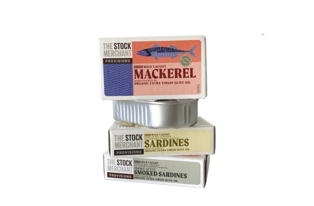
5. Provenance
We’re loving the diversification of the food production world as do consumers. Always talk about the unique methods, artisans, and regions behind your product.
Some regions already have celebrity status, but increasingly brands are touting regions with a niche appeal. For example, our packaging for The Stock Merchant makes a hero of Portugal’s Atlantic coast or Moonflowers with its Afghani saffron.
5 micro trends to watch
Some of these trends have been around, but here’s why we think they’ll be embraced more in 2024.
1. Maximalist design
Forget your polite little patterns and orthodox food photos. Brands with bold personalities are sporting in-your-face colours, supersized graphics, and high-energy images, such as our work for Ridiculously Delicious Peanut Butter. More recent examples of this bold look include the new packaging concepts for Mutti, Farmer Jo, Gelatissimo, and even a collection of Woolies home-brand coffee pods.
2. Mascots
There was a time when mascots required an entire backstory (Colonel Sanders, Ronald McDonald). The newer raft of mascots don’t need a biography – they simply add a lovable or innocent quality to brands that tout those attributes. Examples are Heaps Normal’s walking brain mascot, and Good Stuff’s cereal boxes featuring friendly cartoon eyes and mouths.
3. Hand-illustrated ingredients
A few years ago, Chobani launched its new packaging featuring wonky hand-painted ingredients – instead of ultra-perfect photoshopped ones. Increasingly, we’re seeing other clean’n’natural brands taking a similar approach to communicate their old-fashioned clean composition. Some examples are the expanding collections from Proper Crisps, Heyday Canning Co and Coyo.
4. Sticker-book aesthetic
When nostalgia is one of your brand values, you get to play with quirky fonts, illustrations and more. Cue the schoolroom sticker style used on products such as Henry Manteca’s spreads and Pat and Stick’s ice cream.
5. Levitating food photos
It’s tough being a respectable food brand. On the one hand, natural is good. On the other, overly imperfect food photos can look unappetising. Enter the ultra-stylised stacked-ingredients photo, making your food look like a 3D artwork you can see on new packaging from Cadbury, Pringles, and Marion’s Kitchen.
Long story short: be modern, not trendy. Stick with your strategy and the truth of your brand and talk to your designer about ways to bring this to life. 
This story first appeared in the February/March edition of Food & Drink Business magazine.


